Draw Photo Histograms: D3 + Canvas
The Finished Product
Histograms Redux
We’ve previously discussed histograms in this tutorial. Today, we’ll use that knowledge and apply it to making a histogram that shows the RGB distribution of an image the user uploads in the browser. We’ll graph all three components' frequencies with D3 and allow the user to highlight individual components. Sound like a lot of work? It’s not too bad actually!
High-Level Structure
Good code is like good plumbing. The memory doesn’t leak. Things flow in the direction you’d expect. Pipes do not simply terminate. Coding an app could be described simply as collating streams of data and creating pipes to make the data interact in meaningful ways to solve a task.
So let’s go with that: the task we want to solve is to display a histogram of a user-uploaded image. The image does not need to persist, so we can do it all in the browser.
We need to load the image from the user and pipe it into something that will allow us to extract its pixel data. For this, we’ll use HTML5 canvas.
Then, we need to process that pixel data and pipe it into something that will allow us to display it. For this, we’ll use D3.
So the pipes are User -> Canvas -> Pixel Data -> Histogram Data -> D3.
Pipe 1: User -> Canvas
We’ll use a file input to allow the user to upload an image.
<input type="file" id="imageFile" accept=".png, .jpg, .jpeg"></input>
You can restrict the types of files a user can upload using the input. In this case, we’ll limit it to images.
We add an event listener to the input element for a change event.
document.getElementById("imageFile").addEventListener("change", handleFiles);
Then we write a function to handle the file upload when it occurs.
function handleFiles() {
  var theImage = document.getElementById("imageFile").files[0];
  var img = new Image();
  var reader = new FileReader();
  reader.addEventListener("load", function () {
    img.src = reader.result;
  });
  img.onload = function () {
    calcAndGraph(img);
  };
  if (theImage) {
    reader.readAsDataURL(theImage);
  }
}
The files are passed into the files array. We only are going to grab the first file, if the user selects more than one.
Once we have the file, we have to use a FileReader in order to asynchronously read its contents into memory.
The FileReader returns a “load” event when the file is successfully read. The resulting data is present in the result property of the FileReader.
We make sure that the user actually entered a file in the box (if (theImage)). If so, we initialize the FileReader with readAsDataUrl (Docs). This reads the contents of the file and returns a result formatted as a base64 encoded data string. This string can be displayed directly as the src of an image tag.
We create this image tag, and when the file is successfully read, we set its src to the reader.result. When the image is successfully loaded, we pass it into our calcAndGraph function.
Pipe 2: Canvas -> Histogram Data
Now that we have our image, we are going to put it into the canvas and generate a histogram from canvasData.
We set our canvas height and width to that of the image’s height and width. Then, we draw the image to the canvas with drawImage. Once the image is on the canvas, we can call getImageData, which will return an ImageData object (Docs). The object contains three properties: height, width, and data.
Data is a Uint8ClampedArray. This sounds complex, but it’s quite simple. It’s an 8-bit Unsigned Integer array. 8 bits can store 2^8 or 256 unique values (0-255). Unsigned means it cannot store negative numbers: all of the bits are used to store numeric values: there is no sign bit.
Clamped means that attempting to place a non-integral entry in the array will round the value to the nearest integer (3.4 -> 3, 3.51 -> 4), and that all values below 0 will be set to zero. Similarly, all values greater than 255 will be set to 255.
If you think about the RGB color model, this is the perfect data structure. Each pixel in the image is represented by four entries in the array: a R, G, B, and A (alpha) value. To read sequential pixels' RGBA values, you skip ahead by 4.
Now that we have the data, we create three dictionaries that we’ll use to hold the number of occurrences of a red, green, and blue pixel of a given intensity, rD, gD, and bD, respectively.
We instantiate the dictionaries by setting the initial frequency of every pixel to 0. We do this because it’s possible that an image might not have all 256 values for a given color component.
Finally, we iterate through the array, moving forward pixel by pixel (i+=4), assigning the i-th, i+1th, and i+2th pixel to the red, green, and blue dictionaries, respectively. The i+3th value is the alpha, or opacity. In our case, we’re ignoring this channel.
function calcAndGraph(img) {
  let rD = {},
    gD = {},
    bD = {};
  let cv = document.getElementById("C");
  let ctx = cv.getContext("2d");
  cv.width = img.width;
  cv.height = img.height;
  ctx.drawImage(img, 0, 0);
  const iD = ctx.getImageData(0, 0, cv.width, cv.height).data;
  for (var i = 0; i < 256; i++) {
    rD[i] = 0;
    gD[i] = 0;
    bD[i] = 0;
  }
  for (var i = 0; i < iD.length; i += 4) {
    rD[iD[i]]++;
    gD[iD[i + 1]]++;
    bD[iD[i + 2]]++;
  }
  histogram({ rD, gD, bD });
}
Once we create these three pixel frequency dictionaries, we’re done with the canvas. We pass the data into our histogram function for display.
Pipe 3: Histogram Data - > D3
The histogram function is pretty typical D3. histogram wraps an inner function that graphs individual histogram components. We establish base dimensions for the graph and margins as well as the y-axis labels. We size the svg component in the HTML accordingly. Then we call graphComponent, our inner function, with each of the three datasets and the desired color to display.
graphComponent does the main work of the graphing: it removes existing values (remember, the user can upload photo after photo, and we don’t want old data to persist) as well as resets the yAxis. We only need to draw the y-axis once per data set, since we’re overlaying all three bar groups. We set the flag once we’ve drawn it, and reset the flag once we draw a new histogram’s worth of data.
We map the data to an index (object key) and frequency (object value).
Then we create bars for each data element. Pretty easy.
function histogram(data) {
  let W = 800;
  let H = W / 2;
  const svg = d3.select("svg");
  const margin = { top: 20, right: 20, bottom: 30, left: 50 };
  const width = W - margin.left - margin.right;
  const height = H - margin.top - margin.bottom;
  let q = document.querySelector("svg");
  q.style.width = width;
  q.style.height = height;
  if (yAxis) {
    d3.selectAll("g.y-axis").remove();
    yAxis = false;
  }
  function graphComponent(data, color) {
    d3.selectAll(`.bar-${color}`).remove();
    var data = Object.keys(data).map(function (key) {
      return { freq: data[key], idx: +key };
    });
    var x = d3
      .scaleLinear()
      .range([0, width])
      .domain([
        0,
        d3.max(data, function (d) {
          return d.idx;
        }),
      ]);
    var y = d3
      .scaleLinear()
      .range([height, 0])
      .domain([
        0,
        d3.max(data, function (d) {
          return d.freq;
        }),
      ]);
    var g = svg
      .append("g")
      .attr("transform", `translate(${margin.left}, ${margin.top})`);
    if (!yAxis) {
      yAxis = true;
      g.append("g")
        .attr("class", "y-axis")
        .attr("transform", "translate(" + -5 + ",0)")
        .call(d3.axisLeft(y).ticks(10).tickSizeInner(10).tickSizeOuter(2));
    }
    g.selectAll(".bar-" + color)
      .data(data)
      .enter()
      .append("rect")
      .attr("class", `bar-${color}`)
      .attr("fill", color)
      .attr("x", function (d) {
        return x(d.idx);
      })
      .attr("y", function (d) {
        return y(d.freq);
      })
      .attr("width", 2)
      .attr("opacity", 0.8)
      .attr("height", function (d) {
        return height - y(d.freq);
      });
  }
  graphComponent(data.gD, "green");
  graphComponent(data.bD, "blue");
  graphComponent(data.rD, "red");
}
User Interaction
We add a few buttons that lets the user focus in on one of the three color components, as well as reset to the initial blend. All that this is doing is changing the opacity of the selected bars.
<button id="red" class="focuser">++R</button>
<button id="green" class="focuser">++G</button>
<button id="blue" class="focuser">++B</button>
<button id="blend" class="focuser">Blend</button>
document.querySelectorAll("button.focuser").forEach((button) => {
  button.addEventListener("click", amplify);
});
We create an event listener for the buttons that sends all clicks to our amplify handler.
function amplify(e) {
  const colors = ["red", "green", "blue"];
  const boost = e.target.id;
  if (boost == "blend") {
    document.querySelectorAll("rect").forEach((bar) => {
      bar.style.opacity = 0.7;
    });
  } else {
    activeColor = boost;
    const deaden = colors.filter((e) => e !== boost);
    document.querySelectorAll(".bar-" + boost).forEach((bar) => {
      bar.style.opacity = 1.0;
    });
    deaden.forEach((color) => {
      document.querySelectorAll(".bar-" + color).forEach((bar) => {
        bar.style.opacity = 0.2;
      });
    });
  }
}
Amplify sets the current active color. If it’s blend, we set all opacities equal. Otherwise, we set the active color opacity to 1 and the background opacities to 0.2. Since we’ve set a unique class for each of our bar sets, this is simple “select bars + change values”.
Making It Pretty
Finally, to make things pretty, so that the user sees results immediately, we’ll pass in a base64-encoded image of a cat, stored in a string, and run our histogram code on it.
document.addEventListener("DOMContentLoaded", function (event) {
  var img = new Image();
  img.onload = function () {
    calcAndGraph(img);
  };
  img.src = catImg;
  addListeners();
});
Us versus Apple Preview
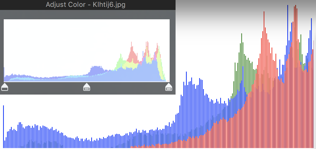
Here’s the original image opened in Preview compared with our app. Nice. Preview displays a few other components on the graph, hence the slightly differing on the right.
🐱 TIL
Histograms are pretty simple, and so is combining simple components to make a bigger product. Now that we know how to grab an image from the user and access its pixel data, think about all the other cool things we could do:
- calculating summary statistics on the image data distribution
- create an
isOverexposedfunction - create an “Auto-Adjust” to automatically smooth out the pixel distribution
Exercises for the reader. Experiment & grow!